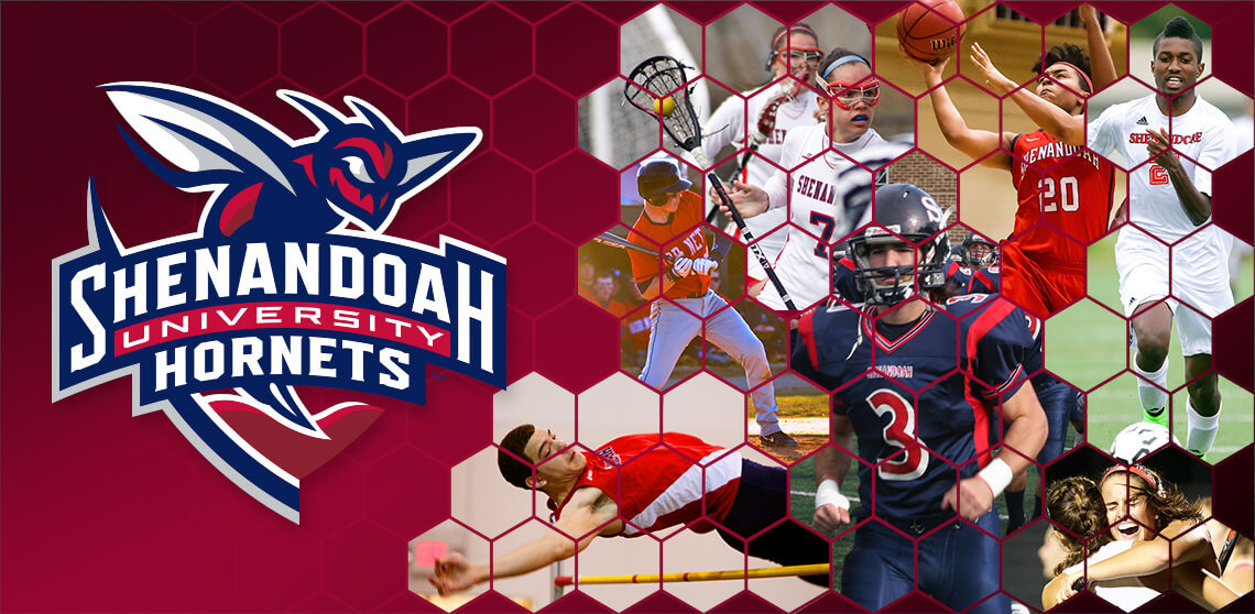
 The Shenandoah University Department of Intercollegiate Athletics unveiled a new graphic identity on Wednesday, April 22, at an open house hosted in the Ferrari Room of the Brandt Student Center.
This new identity, created by New York City-area design firm Skye Design Studios in conjunction with a university-based committee, consists of primary, secondary, and tertiary logos as well as wordmarks and a custom typeface.
Icons for the department’s Twitter feed, @suhornets, as well as other social media outlets were also designed.
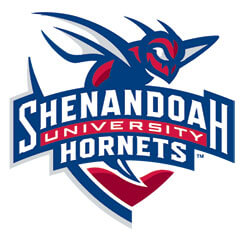
The primary mark, consisting of the university’s mascot resting on top of a stylized mountain range and displays the words ‘Shenandoah University Hornets’, uses the department’s existing red and blue colors and adds gray and the university’s red as official athletics colors.
“Our primary mark captures the passion and energy of SU Athletics,” Athletics Director Doug Zipp said. “We wanted a new identity that was fresh, relevant and modern, and also told the story of who we are.
“The primary mark, by using positive and negative space, connects us back to the university’s crest. The stinger cuts through a valley, giving us a sense of place, and the arched lettering evokes the iconic red bridges throughout campus.
“Even the typeface design has its origins here – we looked through yearbooks and archived documents as well as past uniforms as inspiration for the letters.
“The addition of the university’s red into the color palette reinforces that we are part of the larger university community. This was an important goal of this project and we think we have hit on this goal perfectly.”
The secondary logos, a hornet and an SU, connect back to the primary mark through the sliver of the university’s crest. The SU also features a stylized ‘stinger’ in the lower left tail of the ‘S.’
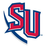
Secondary Mark – SU
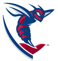
Secondary Mark – Hornet
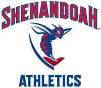
Tertiary Mark
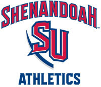
Tertiary Mark
 Team customization is contained within the tertiary logos and wordmarks. Logos using both secondary marks are available for all 21 teams as well as athletic training, strength and conditioning, communications, and the department’s fundraising group, the Hornet Club.
 As part of the custom typeface, a script “Shenandoah” and “Hornets” were designed for uniform use.
The complete identity is contained within an athletics style guide developed as part of the project.
“We wanted to have a consistent style and look for our teams. Brand identity is so important to the overall impression of our department and the university as a whole. Our goal is have a recognizable family of logos that everyone identifies as Shenandoah Athletics,” Zipp said. “We have been able to achieve the consistent look through a style guide that will keep us all ‘on the same page’ so it becomes obvious to everyone who sees us that we are all part of one team.
“This has been a tremendous project and I want to thank everyone at the university and in the community who participated during our feedback sessions throughout the year. The information we learned was vital to the process and helped us create a new graphic identity for Shenandoah Athletics that truly represents who we are.”
Athletics Brand Identity Fast Facts:
Designer: Skye Design Studios
Timeline: February 2014 – April 2015
Deliverables: Primary, secondary and tertiary logos, wordmarks, and typeface
Frequently Asked Questions:
Why design a new graphics identity?
There are so many new and exciting things happening at Shenandoah that it was time for athletics to adopt a new look that represents its connection to the university. The previous athletics identity was expressed in two separately designed, interchangeable logos (a hornet and an SU),that did not function in tandem. The hornet, used since 1991, also needed an update.
Who will use this system?
Shenandoah University Intercollegiate Athletics and its 21 teams. We are confident the new marks and mascot will be popular throughout the entire university community. Any use of the athletics logos must have prior approval of the intercollegiate athletics department. Licensing fees do apply for outside vendors.
When will these new logos begin their use?
Effective April 22, 2015, this is the official brand identity for the intercollegiate athletics department. Beginning today, the new logos appear on all printed material as well as www.suhornets.com.
When will the uniforms begin to show the new logos?
There is a three-year plan for all 21 teams to update their uniforms with the new graphic identity.
When will apparel be available with the new logos?
Immediately. The campus bookstore has various items (T-shirts and polos, hats, sweatshirts, window clings) featuring the new logo family.
What are the colors?
In addition to the prior intercollegiate athletics department red and blue (PMS 193 and PMS 281 C), the university’s red (PMS 202 C) and a new color, Shenandoah gray (PMS 428 C), have been added.
